 John Niles
Introduction
Mobile-first design is not just a trend but a necessity for businesses that want to remain competitive in today’s market. Mobile users have unique needs and behaviors, and their browsing habits are different from desktop users. They are often on the go, have less time, and expect faster load times and easy navigation. By prioritizing mobile design, designers can create a site that provides a seamless and efficient experience for mobile users, resulting in higher engagement, more conversions, and increased revenue.
Responsive web design is often confused with a mobile-first design, but they are not the same. Responsive web design is a technique that enables a website or application to adapt to the screen size of the device being used.
While it is an essential aspect of mobile-first design, it does not prioritize the unique needs of mobile users. In contrast, mobile-first design involves designing with the smaller screen in mind, ensuring that the site is optimized for smaller screens and touch-based interactions.
In addition to providing a better user experience, mobile-first design can also improve accessibility. Designers can ensure that the site is accessible to all users, regardless of their abilities, by using descriptive alt tags, high-contrast colors, and readable fonts. This not only improves the user experience but also ensures that the site complies with accessibility guidelines and regulations.
In the following sections, we’ll explore the best practices and considerations for mobile-first design in more detail, including touch-friendly interactions, small-screen design considerations, compatibility with mobile devices, and optimizing images and videos for mobile devices. We’ll also discuss the best tools that designers can use to optimize their mobile-first designs for better user experiences and improved search engine rankings.
What is Mobile-First Design?
Mobile-first design is a web design strategy that involves designing a website or application for mobile devices before designing for larger screens. This approach ensures that the site is optimized for the smaller screen size and touch-based interactions. By prioritizing mobile design, designers can ensure that the site provides a seamless and efficient experience for mobile users. It is all about staying align with web design trends.
Responsive Web Design
Responsive web design is a technique that enables a website or application to adapt to the screen size of the device being used. Responsive design is often confused with a mobile-first design, which involves designing with a smaller screen in mind. Responsive design, on the other hand, is a technique for optimizing the design for all screen sizes.
Progressive Advancement & Graceful Degradation
Progressive advancement and graceful degradation are two strategies for designing websites that work well on both mobile and desktop devices. Progressive advancement involves starting with a basic mobile design and adding features as the screen size increases. Graceful degradation involves starting with a desktop design and removing features as the screen size decreases. Both strategies involve designing with the unique needs of mobile users in mind.
Why is Mobile-First Design Important?
Mobile-first design is essential for providing a seamless and efficient experience for mobile users. Mobile devices have different characteristics compared to desktops, and mobile users have different behaviors and expectations. The mobile-first design ensures that the site is optimized for the smaller screen size and touch-based interactions. Additionally, mobile-first design can improve search engine rankings as Google prioritizes mobile-friendly websites.
The Difference Between Mobile First and Responsive Web Design
Responsive web design and mobile-first design are two approaches to web design that are often used interchangeably. While they share some similarities, there are fundamental differences between the two approaches.
Responsive web design is a technique that enables a website or application to adapt to the screen size of the device being used. This means that the layout, images, and content adjust to fit the screen size of the device. Responsive design is often achieved using CSS media queries, which allow designers to specify different styles for different screen sizes.
Mobile-first design, on the other hand, is a design strategy that involves designing for mobile devices before designing for larger screens. This approach prioritizes the unique needs and behaviors of mobile users and ensures that the site is optimized for smaller screens and touch-based interactions.
The main difference between responsive web design and mobile-first design is the approach taken. Responsive web design starts with designing for the desktop and then adapting the design to fit smaller screens, while mobile-first design starts with designing for the mobile screen and then adapting the design to fit larger screens.
Pick A Linux Shared Hosting Plans for Improved Hosting Experience.!
Responsive web design can be an effective approach for websites that have a significant amount of content and functionality that needs to be accessible on all devices. However, it can lead to bloated code, slower load times, and a less-than-optimal user experience on mobile devices.
Mobile-first design, on the other hand, prioritizes the user experience on mobile devices, which is becoming increasingly important as more and more users access the web on their smartphones and tablets. By designing for the mobile screen first, designers can ensure that the site provides a seamless and efficient experience for mobile users, resulting in higher engagement, more conversions, and increased revenue.
Another important difference between responsive web design and mobile-first design is the design considerations that each approach prioritizes. Responsive web design prioritizes the layout and content, while mobile-first design prioritizes touch-friendly interactions, small-screen design considerations, compatibility with mobile devices, and optimizing images and videos for mobile devices.
For example, in a responsive web design approach, designers may use a single-column layout for smaller screens, while using a multi-column layout for larger screens. In a mobile-first design approach, designers may use a single-column layout for all screens and prioritize touch-friendly interactions to ensure that the site is easy to use on small screens.
The mobile-first design also prioritizes accessibility, which is critical for ensuring that the site is accessible to all users, regardless of their abilities. Designers can ensure accessibility by using descriptive alt tags, high-contrast colors, and readable fonts.
Related: Web Design: The Top Trends You Need to Know About
The Connection Between Mobile-First Design and Accessibility
Accessibility is a critical consideration for mobile-first design. Designers should ensure that the site is accessible to all users, regardless of their abilities. Mobile-first design can improve accessibility by prioritizing touch-based interactions, optimizing for small screen sizes, and using responsive typography. Designers should also use descriptive alt tags, high-contrast colors, and readable fonts to ensure accessibility for mobile users.
Google CrUX (Chrome User Experience Report)
The Chrome User Experience Report (CrUX) is a public dataset that provides information on real-world user experiences on the web. CrUX can be used to optimize the mobile-first design by identifying areas for improvement, such as slow load times, poor interactivity, and poor visual stability. Designers can use CrUX data to optimize their mobile-first designs for better user experiences.
Google Core Web Vitals
Google Core Web Vitals is a set of metrics that measure the user experience of a website. The Core Web Vitals include loading speed, interactivity, and visual stability. Designers can use the Core Web Vitals to optimize their mobile-first designs for better user experiences and improved search engine rankings.
Implementing A Mobile-First Design Approach
Implementing a mobile-first design approach involves prioritizing the design of a website or application for mobile devices before designing for larger screens. Designers should start with a basic mobile design and add features as the screen size increases. This approach ensures that the site is optimized for the unique needs and behaviors of mobile users. Designers should also consider the following steps when implementing a mobile-first design approach:
- Conduct research on mobile user behavior and preferences
- Develop a mobile-first design strategy that prioritizes touch-friendly interactions, small screen design considerations, compatibility with mobile devices, optimizing images and videos for mobile devices, and accessible design for mobile users
- Use responsive design techniques to ensure that the site adapts to various screen sizes
- Test the site on various mobile devices and browsers to ensure compatibility
- Monitor performance using tools such as Google CrUX and Core Web Vitals
Tips for Transitioning from Desktop-First to Mobile-First Design
Transitioning from desktop-first to mobile-first design can be challenging, especially for designers who are used to designing for larger screens. Here are some tips for transitioning to a mobile-first design approach:
- Start with a basic mobile design and add features as the screen size increases
- Prioritize touch-friendly interactions for mobile devices
- Use responsive design techniques to ensure that the site adapts to various screen sizes
- Test the site on various mobile devices and browsers to ensure compatibility
- Use analytics tools such as Google Analytics to monitor user behavior and make adjustments accordingly
Related: How to Build Customer Trust with the Power of Web Design?
Best Practices for Mobile-First Design
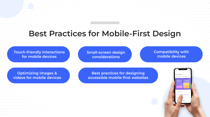
When designing for mobile-first, designers should consider the following best practices:
- Touch-friendly interactions for mobile devices: Designers should prioritize touch-friendly interactions for mobile devices by using large buttons, reducing the number of form fields, and ensuring that all elements are easily tappable on small screens.
- Small-screen design considerations: Designers should optimize the design for small screens by using clear and concise language, prioritizing the most important content, and minimizing clutter. This ensures that the site is easy to navigate on a smaller screen.
- Compatibility with mobile devices: Designers should ensure that the site is compatible with various mobile devices and browsers. This involves using responsive design and testing the site on various mobile devices and browsers to ensure compatibility.
- Optimizing images and videos for mobile devices: Mobile-first design involves optimizing images and videos for mobile devices. Large images and videos can slow down the site and take up valuable screen real estate. Designers should use compressed images, lazy loading, and video compression to optimize images and videos for mobile devices.
- Best practices for designing accessible mobile-first websites: Designers should ensure that the site is accessible to all users, regardless of their abilities. This involves using descriptive alt tags, high-contrast colors, and readable fonts to ensure accessibility for mobile users.
Best Tools to Use for Mobile-First Design
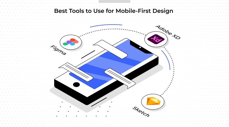
Designers can use a variety of tools to optimize their mobile-first designs. Here are some of the best tools for mobile-first design:
- Figma: Figma is a cloud-based design tool that enables designers to collaborate on mobile-first designs. Figma includes features such as shared libraries, real-time collaboration, and responsive design.
- Adobe XD: Adobe XD is a vector-based design tool that enables designers to create mobile-first designs for various screen sizes. Adobe XD includes features such as responsive resizing, voice prototyping, and repeat grids.
- Sketch: Sketch is a vector-based design tool that enables designers to create mobile-first designs for various screen sizes. The sketch includes features such as responsive design, shared libraries, and symbol overrides.
Conclusion
Designing for mobile-first is crucial for ensuring that the site is optimized for the unique needs and behaviors of mobile users. By prioritizing mobile design, designers can ensure that the site provides a seamless and efficient experience for mobile users. Designers should consider the best practices and considerations for mobile-first design, including responsive design, user experience design, and accessibility.
They should also use the best tools to optimize their mobile-first designs. By following these best practices and using the right tools, designers can create mobile-first websites that provide a great user experience and improve search engine rankings.
Accessibility is also a critical consideration in a mobile-first design. Designers should ensure that the site is accessible to all users, regardless of their abilities. This involves using descriptive alt tags, high-contrast colors, and readable fonts to ensure accessibility for mobile users.
Additionally, designers should use analytics tools such as Google CrUX and Core Web Vitals to monitor performance and make adjustments accordingly. These tools can provide valuable insights into real-world user experiences on the web and help designers optimize their mobile-first designs for better user experiences and improved search engine rankings.
In conclusion, mobile-first design is a critical aspect of web design that cannot be ignored in today’s mobile-dominated world. Designers should prioritize mobile design and consider the best practices and considerations outlined in this article to create mobile-first websites that provide a seamless and efficient experience for mobile users. In case you do not have any previous experience regarding web designing process, you can look for web design services to keep your website design responsive for all devices. By following these best practices and using the right tools, designers can improve the user experience of their mobile-first designs and ensure that their sites are accessible to all users.
FAQs:
What is a mobile-first approach?
A mobile-first approach is a design strategy that involves designing for mobile devices before designing for larger screens. This approach prioritizes the unique needs and behaviors of mobile users and ensures that the site is optimized for smaller screens and touch-based interactions.
How does mobile-first design improve accessibility?
Mobile-first design can improve accessibility by prioritizing touch-friendly interactions, optimizing for small screen sizes, and using responsive typography. Designers can also use descriptive alt tags, high-contrast colors, and readable fonts to ensure accessibility for mobile users.
What is responsive web design?
Responsive web design is a technique that enables a website or application to adapt to the screen size of the device being used. Responsive design is often confused with mobile-first design, which involves designing with the smaller screen in mind.
What are Google Core Web Vitals?
Google Core Web Vitals are a set of metrics that measure the user experience of a website. The Core Web Vitals include loading speed, interactivity, and visual stability. Designers can use the Core Web Vitals to optimize their mobile-first designs for better user experiences and improved search engine rankings.
What tools can designers use for mobile-first design?
Designers can use a variety of tools for mobile-first design, including Figma, Adobe XD, and Sketch. These tools enable designers to create mobile-first designs that are optimized for various screen sizes and devices.


