 Rajesh Jadhav
Buttons are one of the most common and critical elements of digital website design. They have significance in websites, mobile apps, and software interfaces. Whether it’s user guidance, action triggers, or user experience, buttons create unique meaning to utilize their potential. A Figma button is a great way to explore button design, and it’s a popular design format, given the nature of Figma’s tools, collaborative features, and interactivity. Whether you want a professional look, reusable buttons, or visually appealing buttons, knowing the concept of a Figma button component can help you design a standard button more efficiently.
In this blog, we will discuss Figma button design in-depth, right from basic design principles to interactive prototypes. We’ll be discussing the Figma buttons tutorial, how to create Figma components, Figma auto-layout for your buttons, and designing Figma buttons with icons. Regardless of your skill level, from beginner to intermediate to advanced, this guide will help you become a Figma buttons pro.
Table Of Content
Figma Buttons Simplified
When talking about a button in Figma, it can be as simple as text on a rectangle or a complex component with a hover state, icon, or animation. Figma buttons are flexible and customizable, allowing designers to develop consistent, usable components across screens and contexts.
When working on a project in Figma, you may find buttons of primary, secondary, text, and icon. Each type of button has a specific function. For instance, primary buttons are for the primary action on a page, and secondary buttons are used for additional actions. Creating Figma button components enables you to be consistent throughout your project, saving you time and ensuring you design correctly.
Figma buttons are thoughtfully designed, ensuring a user-friendly nature, and describe the actions that will occur. Thoughtful button design in Figma involves considering placement, color, typography, spacing, and accessibility. Even small interactions, such as hover effects and moving animations when clicked, make your buttons feel more active and intuitive.
Best Practices and Tips for Figma Button Design
– Size & Spacing
Your Figma buttons design should be of a reasonable size for simple clicks, touch targets, or mobile devices. An ideal height is 40-48px.
– Color & Contrast
The text should have enough contrast to be readable and accessible to all users. A well-chosen color palette is essential, as it forms the core of effective Figma button design.
– Typography
Keep the text light to read. There should be a reasonable font size and clear weight in order to draw importance. Don’t overstuff the text in the button.
– States
Create multiple states for each button: default, hover, active, and disabled. This is where Figma interactive buttons get fun: They can be used to prototype and visualize the states.
– Icons
Icons are always a nice element to add to buttons, giving them greater intuitiveness, especially for common actions like search, delete, or upload. However, Figma buttons with icons can be both functional and intuitive, allowing users to quickly understand their purpose.
Figma Buttons Tutorial with Practical Approach
1. Make a Shape
Begin by creating a rectangle or a rounded rectangle that visually appears as your button. This will be the shape of the button. You can modify the corner radius to maintain a style of either softer or sharper edges.
2. Add Colors
Add a background color to the button covering color that contrasts with the text. You can create a hover state by slightly adjusting the color or opacity with different variations.
3. Add Texts
Start adding a text layer on top of your rectangle. Select an easily readable font, size, and weight. The text can be kept simple and straightforward.
4. Add Auto layout
Convert your rectangle and text to a Figma auto layout button. Auto layouts are the best way to ensure all padding remains consistent, as Figma allows auto layouts to change the size of the button when the text changes.
5. Adding Interactive states
You can use the prototyping features to create a Figma interactive button. You can create hover, click, or loading states using Smart Animate that feel more realistic.
Scalable and Reusable Figma Button Components
Components are one of Figma’s greatest features. Components enable you to convert a button into a Figma button component, create consistency through your project, and speed up your design workflow.
Here’s how to create one:
– Design the Button
Begin with a fully designed button, including text, color, and even an Icon if needed.
– Convert to Component
Once you’ve designed your button, select the button and press Ctrl+Alt+K (Windows), or Cmd+Option+K (Mac) to create a component.
– Add Component Properties
You can add features within the component that allow you to change text, color, and visibility of the icon or toggle between icons. By defining Component properties, you are allowed to add or change these for different instances of the button.
Drag Instance of Figma Button Component
Drag instances of your Figma Button component into your design wherever you need a button. Finally, if you change the main component (the first button you created), it will also impact all instances in your design, therefore saving you time and ensuring consistency.
A Figma button with an icon can also be created into a component. Simply define the icon as a property, so you can switch the icon on and off for different buttons. Therefore, you don’t have to redesign for each button, making inner components highly adaptable for any project with several buttons or interactive elements.
Building Perfect Figma Auto Layout Button
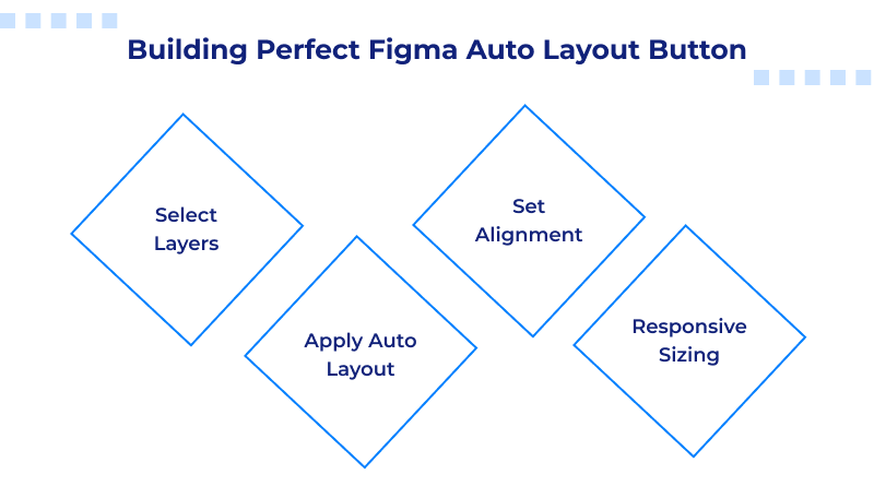
Below are the steps to use auto layout buttons correctly:
- Select Layers: Group the text, along with any icons.
- Apply Auto Layout: Use the “Auto Layout” feature to configure padding, space between items, and alignment.
- Set Alignment: Align the text and icons to the center, both horizontally and vertically, giving buttons an attractive look.
- Responsive Sizing: When the text changes or you add/remove an icon, the button will automatically size itself. It would need to be responsive when designing a Figma button for devices.
By simply using auto-layout buttons in Figma, you can create buttons that always look good, whether it’s a longer or shorter text version, or if an icon is added. By choosing MilesWeb hosting, you can take your web design to the next level, as they provide an AI website builder that makes things easier for you.
Creating Interactive Buttons in Figma
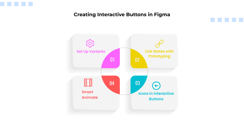
1. Set Up Variants
To start creating interactive buttons in Figma, first, you need to set up your variants, which are necessary for organizing the different states of a button, such as Default, Hover, Pressed, or Disabled. By creating variants within a single component, you will keep everything in place. If you name each variant clearly, designers and developers will be able to quickly locate and use the correct state.
2. Link States with Prototyping
Prototyping is a way to indicate what will happen to a button when it’s used, such as when a user hovers or clicks on it, which helps to create the illusion of interactivity without writing the code. Within Prototype mode, you can drag a connection from the Default state to the Hover state and tell the prototype how to activate its interaction, which can be “While Hovering” or “On Click,” and so on. You will then simply repeat that for the Pressed and Disabled states to ensure you have captured all possible interactions from a user.
3. Smart Animate
By linking variants together in Prototype mode and selecting Smart Animate, you can allow Figma to animate changes. If the user presses the button, it can appear to interact with them by shrinking very slightly. The more subtle and consistent the animation, the more it supports usability without becoming a distraction to the content.
4. Icons in Interactive Buttons
When you add icons to interactive buttons, it increases user engagement. These icons play the role of visual indicators that help users identify their actual function. Icons may be animated or change color after a user hovers over the button or presses it.
Conclusion
Incorporating icons into buttons and developing Figma buttons helps demonstrate interactivity, making your prototypes interesting and realistic. With practice, these techniques can empower you to design user interfaces that are both intuitive and elegant.
Buttons are tiny elements, yet they are powerful in UI/UX design. Getting to grips with Figma buttons will take your digital projects to the next level.
If you’re a beginner just starting with your first Figma button tutorial or an experienced designer looking to improve your Figma button designs, the opportunities are endless.
FAQs
1. What are the necessary steps for transforming a single-button design into a reusable Figma button component?
To convert a button into a Figma button component, design the button in its entirety (text, colors, icons) first. Then, select the button layers and create the component. Next, apply the component properties to work on text, icons, and colors according to your requirements. Finally, you will have a reusable, Figma button component that you can use throughout your project.
2. How can I efficiently use Figma Auto Layout to ensure a button is centered and maintains an appropriate size?
Select the button layers (text, icons, etc.), refresh, and set up the Figma auto layout button settings. Align horizontally and vertically to center the layer(s). Set the padding and spacing to ensure text and/or icons do not overlap. The button will adjust according to the text changes and/or if an icon is toggled. Finally, it will stay centered.
3. How can component properties allow toggling an icon in a button?
When creating a Figma button with an icon, you want to create the icon layer as a component property in the master button component. This allows you to toggle the icon on and off in any instance, thereby not affecting the master component. This is a simple way to maintain consistency and flexibility for those buttons within your design system.
4. What steps do I follow to apply the Smart Animate feature to animate my button transitions?
Once you are in prototype mode in Figma, link all states together and select Smart Animate as the transition type. This will allow for smooth transitions to happen naturally from one state to another. Depending on the elements changed, the button will function naturally with a color change or the icon movement in a more polished and realistic way.


