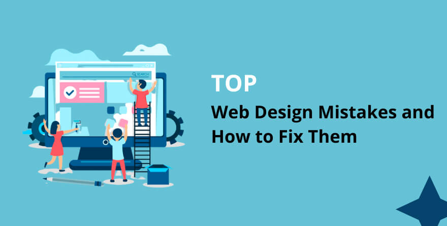
Whether you’re dealing with lost traffic, unhappy customers, or poor search engine optimization (SEO), web design mistakes can be costly. If you run your own business, this can cost you more than just money; it can cost you the reputation of your business and even jeopardize its longevity.
Every business owner in charge of designing his or her website knows how easy it is to make mistakes, especially when you’re new to the business and have no idea what’s involved in creating a functional, effective website. Here are the most common mistakes made when designing a website, along with tips on fixing them and preventing them from happening again in the future.
1. Not Prioritizing on Navigation & Accessibility
Web users want their access to your website to be as easy as possible. People are less likely to explore your site’s different sections without a smooth navigation system. And if they can’t get there, it makes it harder for them to take action on something you’re trying to get them to do, like buy your product or service.
Some top tips for prioritizing ease of use over flashiness:
- Make sure all links are clearly labeled.
- Ensure that all essential information is accessible at a glance (don’t bury important facts).
- Keep navigation menus straightforward.
- Review how easily you can find pages after searching Google.
- Pay attention to screen resolutions – will people with different-sized monitors still be able to verify what they need?
2. No Clear Call-to-Action
Too often, websites lack clear calls to action. If you can’t figure out what a website wants you to do, chances are you won’t do it. With that in mind, make sure your call-to-action (CTA) is always evident; consider making it more prominent than other elements on your page. This is especially true for ecommerce sites—an active CTA button will help convert web visitors into customers!
3. Creating Irrelevant Content
Irrelevant content refers to content that does not fit your brand’s voice or niche. You want your users to know who you are, and it feels off-putting when they come across something out of character for your brand. Keep in mind that you don’t want too much brand consistency either; otherwise, there will be no personality left in your content.
The goal is just enough differentiation so that users trust you more based on previous experiences while maintaining a subtle tone of difference. Also, having multiple authors write for your site may lead to conflicting messages if they’re not all familiar with each other’s writing styles, so having one voice may make sense after all.
4. Falling Behind in Mobile Optimization
Despite web-page design innovations from a decade ago, companies are still falling behind in mobile optimization. They think that because their site is easy to navigate with mouse input it will be just as easy for touch-screen devices.
This couldn’t be further from reality, so here are some guidelines for keeping up with current trends in website design:
- Make buttons large enough so users can tap them easily,
- Use dropdown menus instead of buttons whenever possible,
- Ensure your forms are optimized for mobile.
- At no point should your text input field have fewer than 20 characters remaining before you must hit enter or tab.
5. Lack of Professionalism on Website
Your website says a lot about your company, even if visitors don’t interact with it much. It can often be overlooked as an important marketing asset because most people don’t think of it in marketing. However, your website is one of your most valuable resources because it provides information to customers who are trying to decide whether they want to do business with you.
Even if you have a physical store location, a website is still incredibly important because you can reach customers who live far away from your business’s location. Your website should be easy for potential customers to navigate, but above all else, it should convey professionalism on both a visual and technical level.
Related: Thinking Of Setting Up A Website? This Is All You Need To Know
6. Missing Out on Sales Opportunities
Missing out on sales opportunities is a common pitfall among web design novices. If you want your site to help customers make a purchase, you must know what’s working and isn’t.
Consider carefully where you place Buy buttons, whether or not they’re linked directly from individual product pages, etc. Some marketers like to create an online shopping cart on their website; others prefer pop-up forms. There’s no one-size-fits-all answer for every marketer or business owner, but always keep your conversion rates in mind as you tinker with design details.
7. Not Providing Valuable Info for Visitors
Making a site that’s hard to navigate, or worse, just full of fluff and nonsense, will lead visitors to your site right back out again. Who wants that? Well-meaning web designers who don’t realize their work is anything but. Don’t be one of them.
Spend some time reading reviews about other businesses on Yelp—this will help you understand what makes for valuable content online. Use that information to make sure every page you create has something worthwhile for visitors (without being overly promotional). If it doesn’t, scrap it!
MilesWeb’s Website Builder Help You Create Website in Minutes.!
8. Unprofessional Business Site
The first impression a potential customer or client gets from your website is one of professionalism. If you have a sloppy or unprofessional business site, people will assume that your company is just as careless as your webpage.
This is a misconception you want to avoid to gain trust and respect from others. Here are some ways to avoid unprofessional web design:
- Choosing an overly complicated color scheme
- Buying too many add-ons
- Using affiliate links on every page
- Your product shots don’t match up with what you’re selling
- Make sure nothing looks pixelated
- Putting incorrect information on your contact page
9. No Privacy Policy
A website’s top mistake is that it doesn’t have a privacy policy. When you visit someone’s website, you must know how your information will be used on that site. While you may expect it to be used for commerce, some sites use your data for other reasons.
To ensure you are comfortable with what information about yourself might be collected and how it might be used, always check for a privacy policy before visiting any site or providing personal information. And remember: if there isn’t one, keep looking!
10. Security Concerns & Data Breaches
With hackers becoming more organized, websites must take proper precautions to prevent security breaches. Top web design companies use a combination of VPNs, encryption, firewalls, malware monitoring tools, and password managers to protect users’ information. Ensure your web designer is doing everything possible to keep your data safe.
You can also set up user permissions by implementing multi-factor authentication. This will ensure that even if someone has your username and password, they still can’t get into your account because you have an additional code generator or key for them to do so. It might seem like extra work for you, but it’s better than having hackers steal all of your information!
11. Too Much Stock Photography
You want your website to look professional. But using too much stock photography can make it look less so. Every image on your site looks like it came from a stock photo library, making your whole site look fake and impersonal. Plus, people can tell when an image is a stock photo and it just looks tacky. There are some ways around this problem, though. For example, if you use custom images of your team members or influencers on your site, it will seem more real. You can also use textured backgrounds instead of images if you’re trying to convey the feeling of luxury or opulence. And if you need to use stock photos, find high-quality ones that fit the tone of what you’re trying to communicate with your brand message.
12. Too Many Dynamic Elements
A website should be easy to navigate and use, keeping the number of dynamic elements minimum. Having too many moving parts on a page can make it feel cluttered and overwhelming, which will only serve to frustrate your visitors. If you want people to stick around, keep it simple. Simplicity not only helps with navigation but also helps with SEO. The more complicated your site is, the more opportunity it is for Google to misinterpret what your site is about and get things wrong in its indexing efforts.
13. Poorly Organized Links
If your links are poorly organized, it can be hard for users to find the information they’re looking for. This can lead to frustration and ultimately cause them to leave your site. To avoid this, ensure your links are clearly labeled and easy to find. You can also use a navigation bar to help organize your links and make them more user-friendly. One popular way of doing this is with one tab for each category or topic on your site.
Each tab should have a unique name and contain all the links related to that particular category or topic. Tabs work well because they give you complete control over what’s on each page, meaning you don’t have to worry about adding new content at the top of every page on your site. And if you already have existing pages? Just create tabs with names that match what’s already there!
14. Low-Quality Video/Audio
Low-quality video and audio can make your website look unprofessional and deter visitors. Invest in high-quality equipment to fix this and ensure your videos and audio are edited well. You should also consider hiring a professional to help you with this if you’re not confident in your skills. If you need some inspiration for what type of video or audio would work best for your site, check out other websites in the same industry as yours.
15. No Social Integration
If you’re not integrating social media into your website, you’re missing out on a huge opportunity to connect with your audience. Social media integration allows visitors to like, share, and comment on your content, which can help increase traffic and engagement. Plus, it’s a great way to build brand awareness and establish yourself as an authority in your industry. To avoid this mistake, add social media buttons to your website and make it easy for visitors to share your content.
16. Not Understanding Analytics
Not understanding your analytics is a mistake because you’re not understanding your website visitors. If you don’t know how people find your site, what they’re doing once they’re there, and what’s causing them to leave, then you can’t make informed decisions about improving your site. Not understanding analytics is also a mistake because it means you’re not measuring your success. You might be making changes that don’t have an impact, or you could miss out on opportunities to improve your site because you don’t know what’s working and what isn’t.
Skipping Image Optimization
Leaving images unoptimized is a common design mistake, which can lead to several problems. Not only will your site load slowly, but you’ll also be serving up larger files than necessary, which can consume bandwidth and cost you money. Optimizing your images is essential for a fast, efficient website.
- First, save the image in its original format (usually JPEG or PNG). Then convert the file into a smaller size using an online tool like TinyPNG or FileOptimizer.
- Reduce the quality of the image by 10% to 20%. Quality loss at this level is barely noticeable and won’t have much impact on quality.
- Try cutting file size by stripping out unnecessary information from the image.
You can reduce an image’s file size by choosing one color palette instead of several; limiting gradients; removing metadata that isn’t needed; eliminating text layers from PNGs; optimizing compression settings for JPEGs, so they don’t include extra padding around edges, or turning off support for transparency in GIFs when not needed. Once you’ve made these adjustments, upload the new optimized version of the image to replace the old one.
Conclusion
Now, you have ten mistakes that are easy to make when building a website. And while each has its own solution, you can tackle them all by using an experienced web development company. When you’re just starting out in business, it seems like there are more things you need than time or money.
But an effective website can help you gain new customers, engage with your existing ones, and drive your bottom line higher without having to break your budget. Why leave anything to chance when a few simple fixes could reap such big rewards for your business? Invest in an experienced team that knows how to build effective websites using professional-grade design tools.